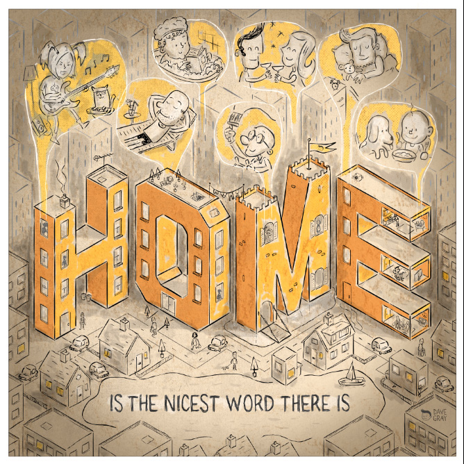
My first mortgage was with Principality Building Society and my experiences of them were very positive. Their latest mortgage campaign encourages customers to share what home means to them. I was asked to illustrate what home means to me using a quote, song lyric or poem which is something that caught my imagination so I thought it would be a good opportunity to write a post about how I approached an illustration project.
There is a lengthy process that I go through with any illustration job. It would be nice if I could sit down for half an hour, do a doodle, email it to my client and then relax with a cup of tea but unfortunately it doesn’t really work like that. At least not for me!
Research
The first step was to start researching. I had to find or write a poem or quote that could be used in the ad. There was no point in drawing anything until I’d fixed this so I had a think. I like to write but I didn’t want to inflict my poetry on the world just yet so I went searching for quotes and came across one that I really liked by American author Laura Ingalls Wilder. The quote read: “Home is the nicest word there is.” I liked it because it made me stop and think about how important our homes are to us and also how home can mean lots of different things to each of us.
Notes
I started to write notes about what home might mean. A place to relax, eat, sleep, spend time with our families, keep pets, be creative. All sorts of things to all sorts of people.
Ideas
Having been a designer for a number of years I tend to think a lot about things before I do them. An idea will usually pop into my head at some point – usually when I’m doing something else. I thought about how it would look on the page. Home is a nice, short chunky word. Often in creativity you are trying to link up two different ideas that wouldn’t normally be put together. I liked the idea of making the letters of HOME into little houses with lots of things going on inside. I thought about doing this from head on perspective but quickly realised that it would work much better as an isometric drawing.
Sketching
After completing a tiny thumbnail sketch I felt that the concept would work. I realised though that the scale would mean that the people would be tiny in the illustration. This was a problem because it’s hard for a viewer to relate to a character if they can’t see their expressions. The solution came in the form of little bubbles placed above the word HOME. These vignettes would allow us to ‘zoom’ in on the action in the little town below so that we could see the expressions and hopefully relate to the people.
Roughs
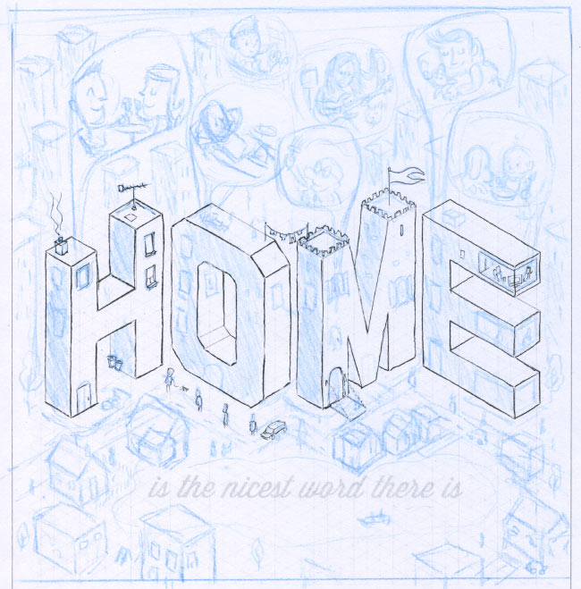
The next step was to create a more detailed rough. I scanned in an isometric grid and created the main lettering. I could have done this on paper but as it was fairly technical I decided that my many mistakes would be more easily rectified on the computer!
Once that was done I printed it out and began to sketch over the top all the ideas. I need to work on paper at this stage as it’s much quicker and gives more freedom. I referred back to my notes for ideas and tried to draw a range of different people. The other thing I’m looking for is that the overall design has a strong layout. That a viewer’s eye can quickly make sense of the image and focus on the right parts. This is probably the most creative stage of the process. This is where all the content and ideas are added to the image and also where all the problems need to be worked out to avoid wasting time later.
It was important to seek client approval at this stage as there’s no point in going further if they aren’t happy with it. Fortunately they could see what I was aiming for and really loved it so I breathed a sigh of relief and carried on…
Line Art
Once I had the rough it was time to start creating the black line work. With a detailed illustration like this it can be very time consuming. Sometimes I do this on paper with ink but in this instance I opted to create the line art on computer using a graphics tablet and Adobe Illustrator.
Again I get approval from the client at this stage before moving on to the next.
Colour and Texture
The next stage is to take the line work and colour it. I use Photoshop for this which gives a lot of control and allows me to change my mind a thousand times. Palette is important and I try to pick a handful of colours for an image that work well together and fit the theme. You can find colour palettes all around – in magazines, shop windows, on the street etc. If I see some colours that work well together and really pop out then I take a picture and store it away in a reference file. Because this was about home I wanted to go with a warm colour palette.
Once I’m happy that the colour looks okay I start to add textures. These can be from photographs I’ve taken of peeling paint or from special brushes I’ve created in Photoshop. The main aim is to add interest to the image and prevent it looking too ‘computery.’ I love the control that a computer gives but if you let it have its way it can make images look flat and boring.
Everyone lives happily ever after.
So when it’s all finished it’s time to step back and look at the end result. The whole process usually takes a few days and once it’s finished then I send it off to the client. Hopefully they love it and then, well then I can relax and have that cup of tea. Oh no wait, there’s that other deadline…


Recent Comments